All posts in Daily grind

03Mar

My free video/audio tips

I can only do minor colour corrections and things like that (which youtube can do anyway). My video ‘editing’ is done with with after effects templates. Meaning I have paid others to do that for me. So I am not what is called a motion graphics designer, but rather a graphic designer/illustrator who specialises in 2d/static images.

In any case, I don’t recommend physically distorting your raw videos using post-processing. If you’re thinking of doing that, don’t. Because your face will also distort… and you will lose resolution & quality. I’m not saying necessarily to redo the ones you already recorded, because that is a PITA. I know.

But I do think it is better to record all *new* raw videos with better lighting and a dedicated mic (eg a lapel mic). That’s the only way. Not everything can be fixed up in post-processing. Better to get it right to start with.

The easiest thing to do is probably just do a screen grab. And possibly embed a webcam of yourself if you want to appear on the video (which lends more credibility, as you are showing your face to the world).

I will try to be a bit more clear here (ugh, design is hard, always lots of communication). What I am saying is, if you are going to do it that way, by standing in front of a camera, IMHO, I think it is better to zoom way back out and do a proper presentation (meaning on a type of stage in a nice environment) OR else set up the map info/source so you don’t need to do any cropping at all, so that what we see is at 100% already.

It’s always going to be difficult to get the correct exposure for both your face and the video (which is black) if you record both simultaneously. I.e. If you put the room light on, the video will look washed out, lose saturation. Vice versa.

Your focus of the video here is that dynamic map. Which is great. So that should be recorded from the original device, not through another camera. Using the video card on your computer for example. You can get software that does this for free. Even when meterologists/weather presenters do their thing, it’s usually composited separately. Meaning they are standing in front of a green screen and the video input of the map comes directly from a computer. And then they blend both together.

If you want to do it the proper Greenscreen way, I would actually consider signing up to Lynda.com for a month or two, which is only like $30 or something, get pro advice from people that know what they are talking about (not me). And you can usually find or get the 1st month for free (a trial). Like I had to learn a bit of After Effects with this guy called rich Harrington. For instance this video Video Gear: Technical Tips, chapters 8-12 may help you a lot. Watch that first then decide if you want to invest in that kind of setup.

I do think standing up in front of an audience adds more credence to what you are saying (see the two vids below as well). So if you don’t go the greenscreen approach, perhaps you could still consider recording a webcam of yourself standing up in front of your computer (which is at the right height). Then the software will or can automatically embed a little video of yourself in the corner, like picture-in-picture. That’s definitely the easy way! Still get the mic though. Sound is just as important is vision.

Instant demo of poor audio vs video quality:

Fantastic demo of different mics + positions.

Make sure the background setting is nice too, people look at that. Look at my background on a few of my 1st webcam videos for instance. It’s shot from my freakin’ bedroom. And it looks horrible/amateurish. The other videos from my own point of view look better (I think).

Another free design tip I can give you is to keep a consistent width on the embedded videos/images in your blog. Right now your images are not a consistent aspect ratio and they are about 496-502 pixels wide whereas your videos are only ever 400. I would make them all 500, 16:9 ratio.

Yes it is extra work, but worth it. I can guarantee you that people –unfortunately– will judge based not just on logic alone, but also appearances. The presentation is everything. I think most scientists don’t fully appreciate that. I never did [before].

24Feb

Eurobodalla Shire logo design.

March 2017 introductory special offer, 50% off logo design (or redesign) throughout the Eurobodalla Shire!

$325 for small businesses with 1 to 3 employees.
$480 for medium-sized businesses with 4 to 6 employees.
$640 for larger businesses with 7-15 employees.
$720 for corporations with 16+ employees.

This includes the following suburbs:

Akolele, Batehaven, Batemans Bay, Bega, Belowra, Benandarah, Bergalia, Bimbimbie, Bingie, Bodalla, Boyne, Broulee, Broulee, Buckenbowra, Cadgee, Central Tilba, Coila, Corunna, Dalmeny, Deua River Valley, Deua. Bolaro, Dignams Creek, Guerilla Bay, Jeremadra, Kianga, Kiora, Lilli Pilli, Malua Bay, Meringo, Merricumbene, Mogendoura, Mogo, Moruya, Moruya Heads, Mossy Point, Mystery Bay, Narooma, Nelligen, Neringla, Nerrigundah, North Narooma, Potato Point, Rosedale, Runnyford, South Durras, Sunshine Bay, Surf Beach, Tilba, Tilba Tilba, Tinpot, Tomakin, Turlinjah, Tuross Head, Tuross Lake, Wamban, Wandera


15Feb

It looks like I lost this client.

Someone approached me late last year to design a business card and possibly rebrand for them as they weren’t happy with their current design.

It was for a naturopath. I really wanted to take on this project. It’s just the sort of clients I’m looking for. Ones that care about the environment. Businesses that provide services.

Now I like to think that I’m a pretty good designer, but I don’t have all that much practise dealing with clients.

So after a few emails I mentioned that they would have to sign a contract for the work to begin.

That was my first mistake. Never again am I going to mention the word ‘contract’. From now on, it will be referred to as “an agreement” or simply “terms and conditions“.

Now I am very keen to design logos. Perhaps too keen. So I started designing it anyway without signing anything.

Why? Because we designers like to start projects early so that we can sit on designs for a few weeks to properly evaluate them. That’s why.

That was my second mistake. Without a contract, I wasn’t actually going to send anything to the client. I mean why should I? I have zero obligation to.

But then I sat on it and I thought about it for a while. And after about a month of no contact, which is too long, I actually sent the previous iteration of this logo to the client, along with two others, like a “free sample” of what I can do.

Because I thought: “well they should at least see what I’ve done, they might like it. It might show that I am enthusiastic about the project and keen to start designing”.

Because sometimes you have to do that in order to get started. You can’t be expected to design logos for people if you have none to show. Right? So it’s a bit like the chicken and the egg syndrome.

And again there has been no response. None. Regardless, at the time. I was still baffled as to why I lost that client.

I can only assume that the client either didn’t like it, didn’t think I was capable of refining my designs even further, didn’t want to sign the contract or perhaps they simply weren’t ‘ready’ to work with a designer.

Since then I have watched about 6 more hours of logo design courses. And I think I know now what was wrong. I think all the ones I sent were all too modern. To me they looked too much like they belonged on a bottle of suncream. But there was nothing more I could do. Without a contract and zero communication, I can’t really go any further. How can I?

I have tweaked in further since they saw it last, and I think this version is superior. And I’d like to show it to my potential future clients anyway.

I changed the typography, added some texture and made it more hand-drawn, so that it appears more natural. Who doesn’t like this logo? I think it’s pretty good…

I would have liked to see this logo on a shopfront. I think this logo could have gone a long way. A long way.

It could have been the start of a multi-million dollar brand. I can see this brand mark on naturopathy bottles. Who knows? Who knows.

As my father used to say “oh well”. I try not to let it bother me.

When taking on board clients, designers take risks. More as a note to my future self than to you, that is why we don’t work without contracts.

What I have I learned by this? Well I have learned that the word ‘contract’ freaks people out. I have learned to stick to my guns and not work for people without contracts, because it shows that they are not as committed as they think they are to hiring a designer.

15Feb

What it takes to design a logo

Now and then I provide comments about people’s logos. It might be on LinkedIn or Quora. So I was just asked again for some design advice. I don’t want to reveal too much personal/private information, so here is a part of my response:

Most logos are, if anything, are too complex. It’s better to be too simple that too complex.

I don’t think non-designers realise that design is a long and ‘iterative’ process, meaning even though the final logo may be a simple symbol, it has gone through many many different steps, perhaps hundreds (if not thousands).

Each time, the designer(s) have the same critical approach. But instead of looking at it for 10 seconds as I did with your logo, we basically do this for hours and hours (and not just 1 or 2 hours, I’m talking 6+ hours for any half-decent logo). That’s basically the difference between a logo that costs $30 and one that costs $600 or more.

There are many questions. Lots of communication needed.

I think some of the hardest logos of all are for personal services and large corporations.

“Do you have any suggestions how to emphasize xyz?”

That is just one of the things that designers get paid for. Another thing is to come up with fresh ideas. Right now I do not have enough information about your service and target market. If you want me to design a logo for you, I can do it, but I can’t work for free.

Anyone can learn to be a designer, but it takes a lot of time, a lot of experimentation, a lot of trial and error, a lot of mistakes and a lot of money. Like a lot of things, it’s easier to just pay someone to do it for you, because you are not just paying for the time it takes to design a logo, but also their experience (which may take five or ten years of learning about design).

I personally think I have chosen the very two fields that people have the least respect for: science and then design. Just because a quality logo appears like it was drawn in five seconds, I can assure you that its development probably took more like five hours.

Logo design is expensive, but it’s often the very first impression that people have about your business. It really needs to have a lot of thought put into it…

11Feb

Today’s big news.

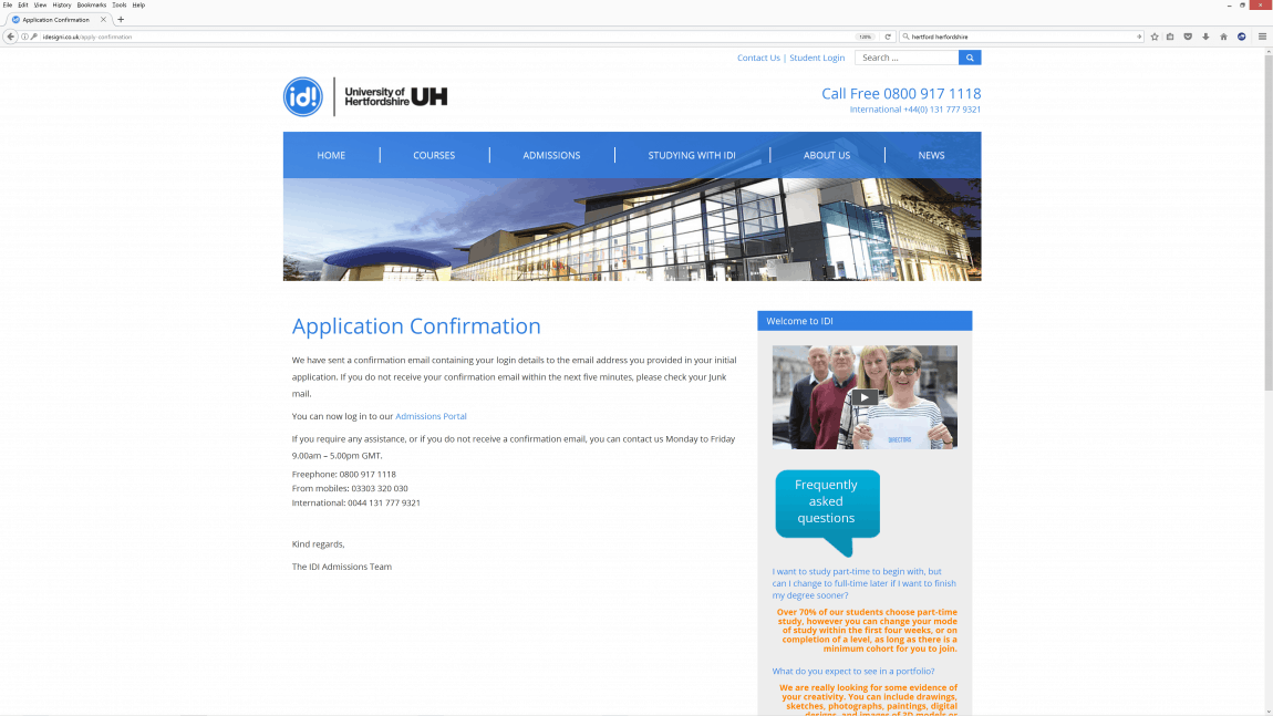
I’ve been thinking about doing a top up illustration degree at this place for about the last year or so. Part time.

idi-hertfordshire-illustration-application

Why? I’ve been feeling a bit lost lately, because my future is uncertain. For one thing, I’ll be moving to Moruya next week.

In my last email enquiry with idesigni.co.uk over a year ago, they told me I’m still not obliged to enroll if I apply.

I don’t know why, but I decided to apply a few days ago.

06Feb

Down a bit of a snake…

Down a snake today in the game of snakes and ladders that is life. There’s some other news that is going to affect my ability to illustrate (probably for the better I suppose).

The day I have been dreading for 25+ years finally arrived. I have been staring at this reminder all week. I visited an ankle surgeon last Monday:

I have been looking at this note all week…

A photo posted by leslie dean brown (@vayakora) on

Today I was informed that I will need major corrective/reconstructive surgery on my left ankle.

It’s four procedures. They are going to slice the rear of my heel right through at a 45° angle (like a potato) and shift its position by 1cm; cut a thin wedge out of one of my midfoot bones and staple it back again; take a tendon out of one part of my foot to replace another; and insert a plug elsewhere…

A photo posted by leslie dean brown (@vayakora) on

Waiting time? 12+ months from today.
Total recovery time after that? Up to 12-18 months.

26Jan

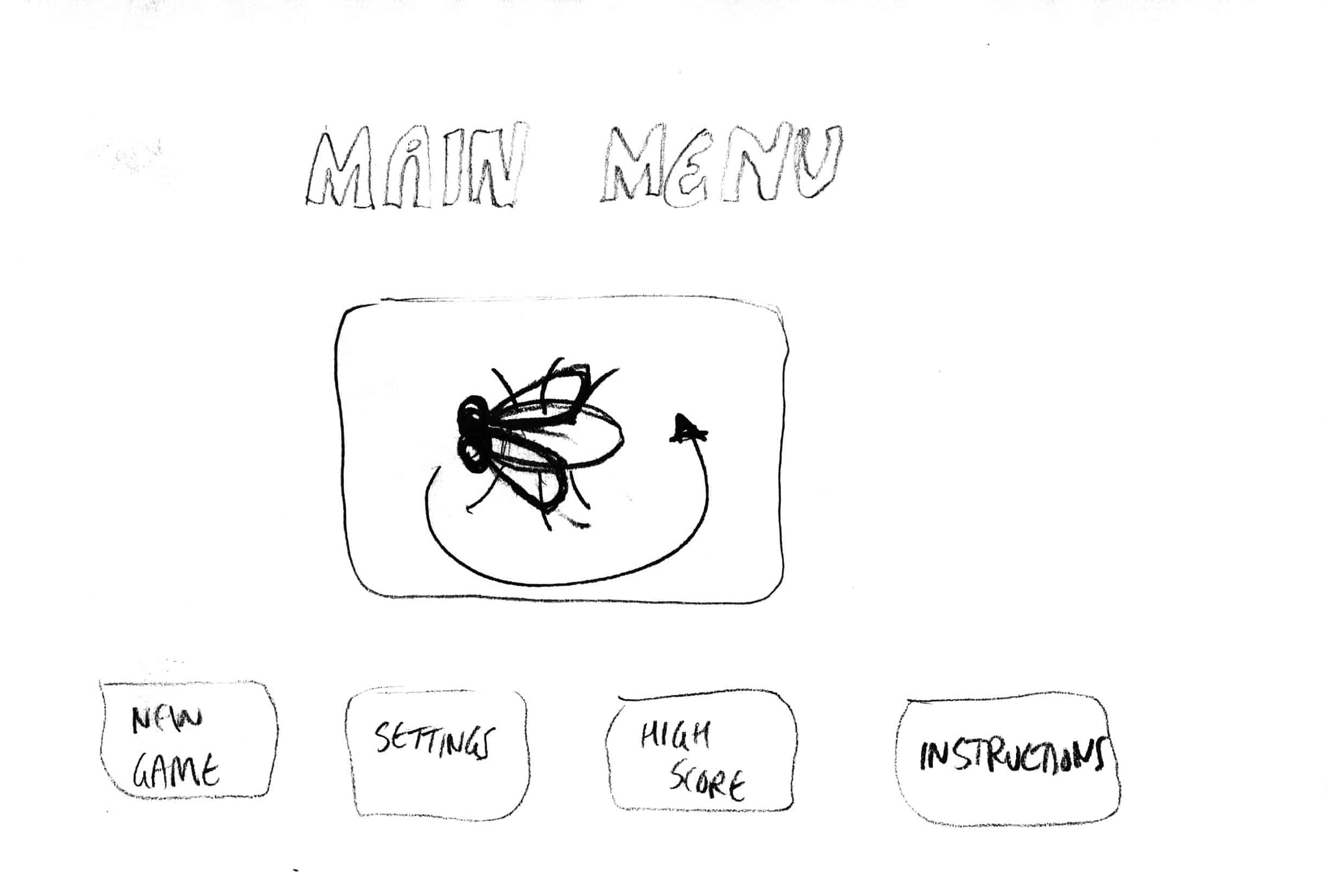
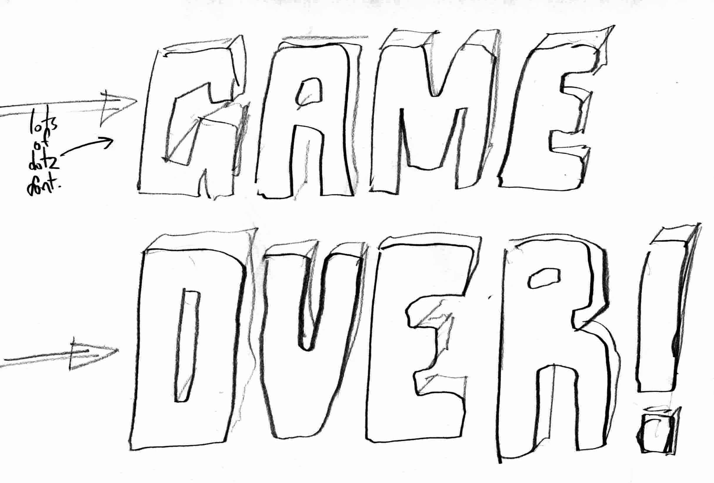
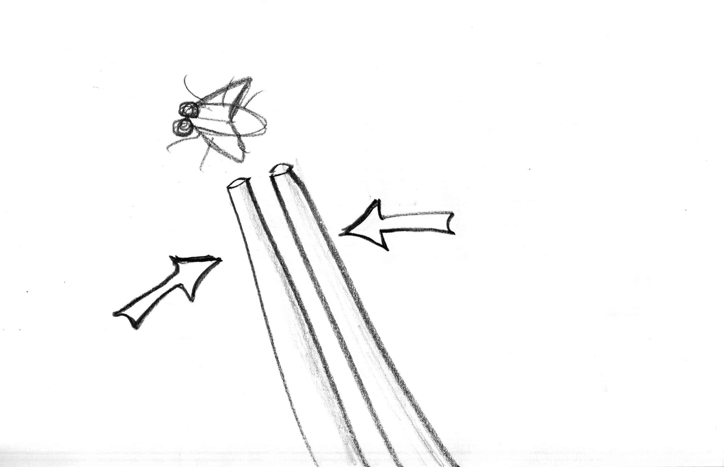
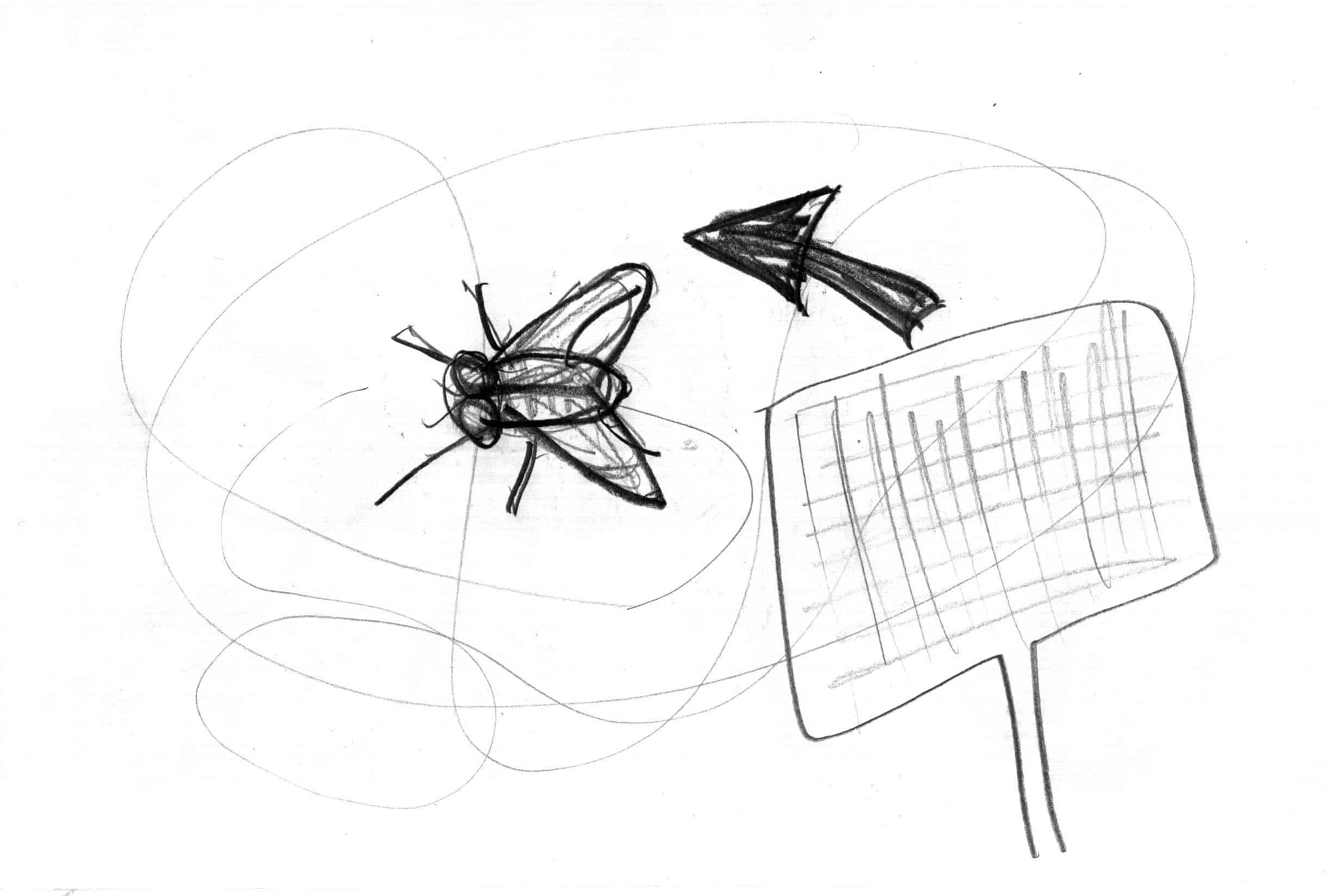
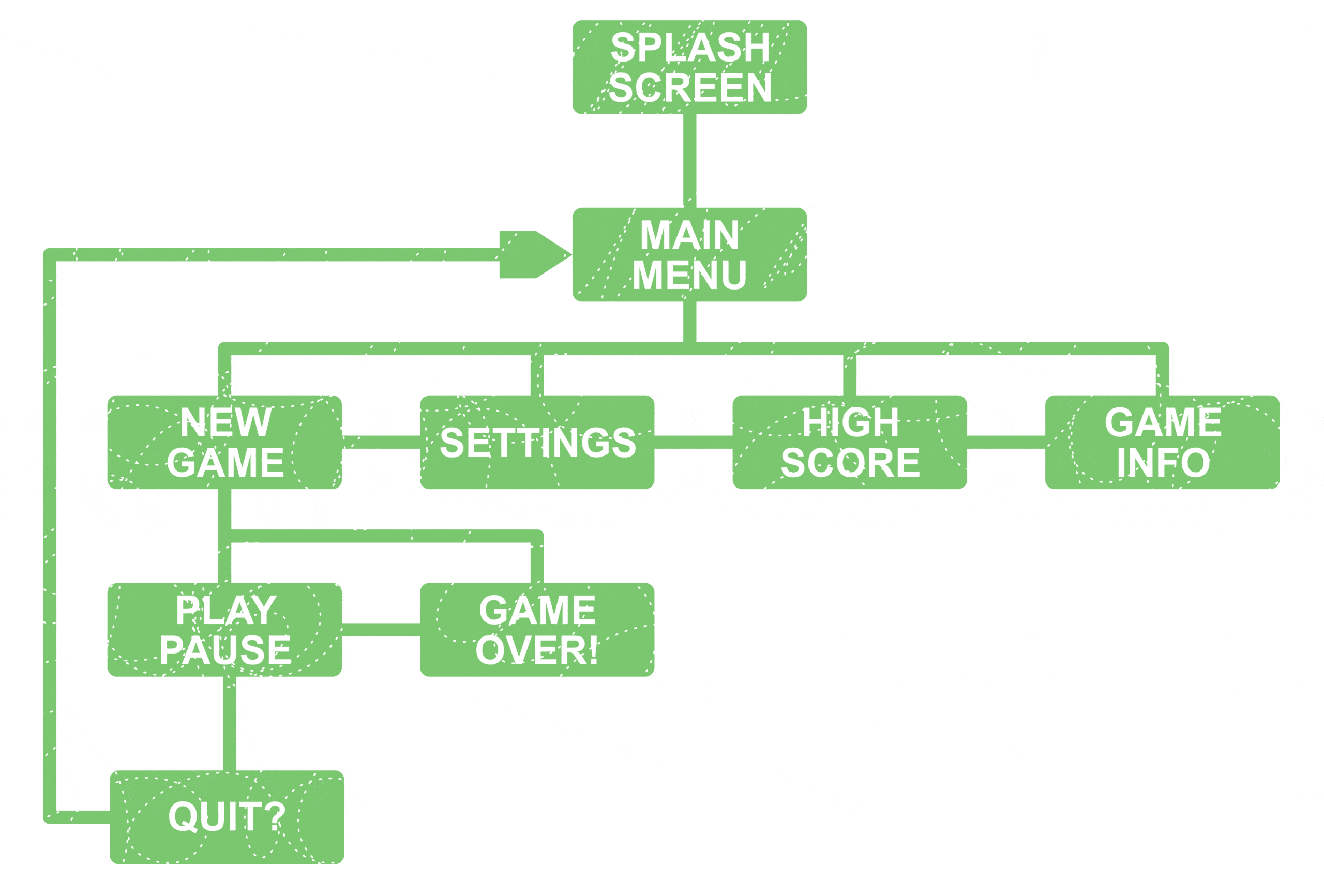
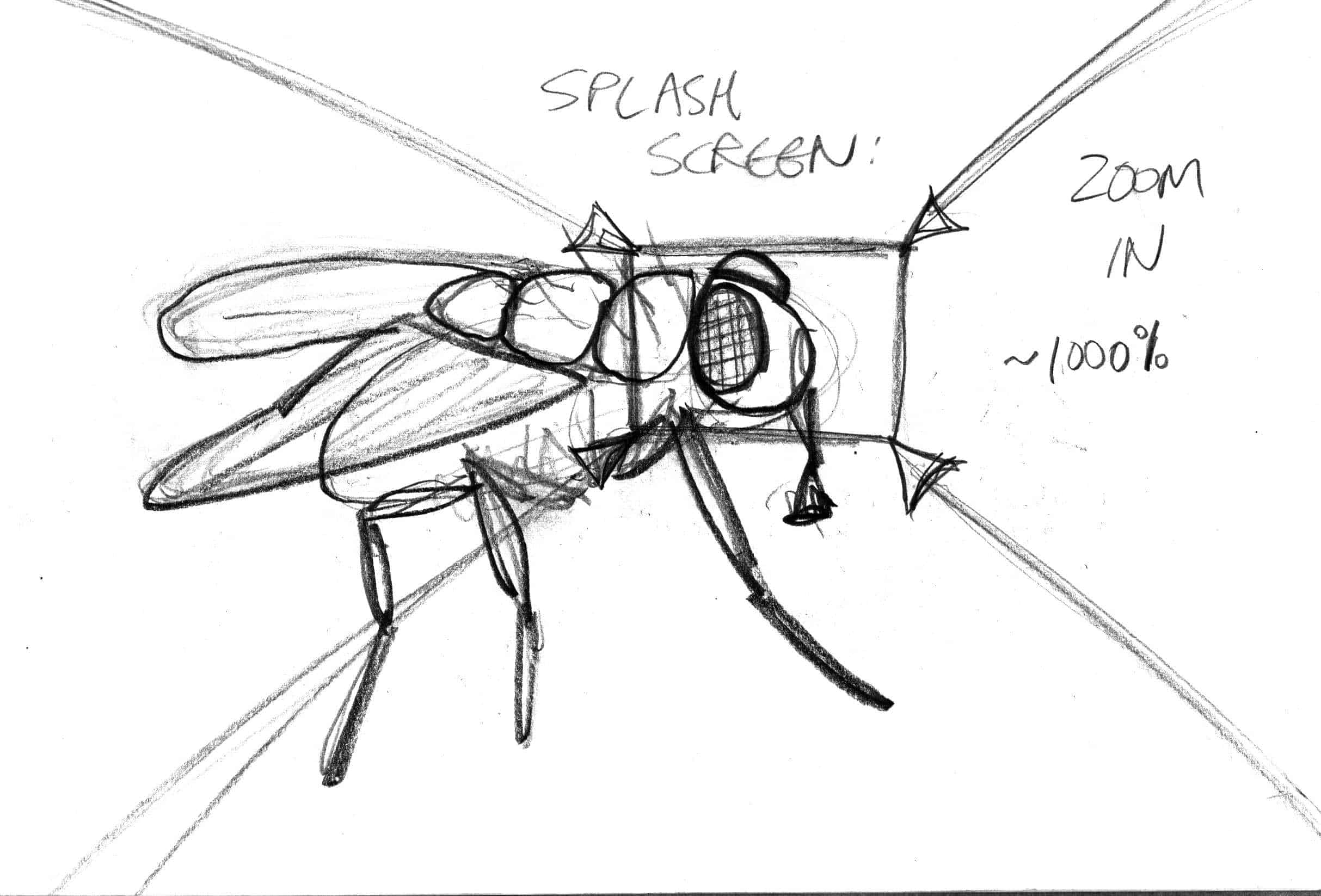
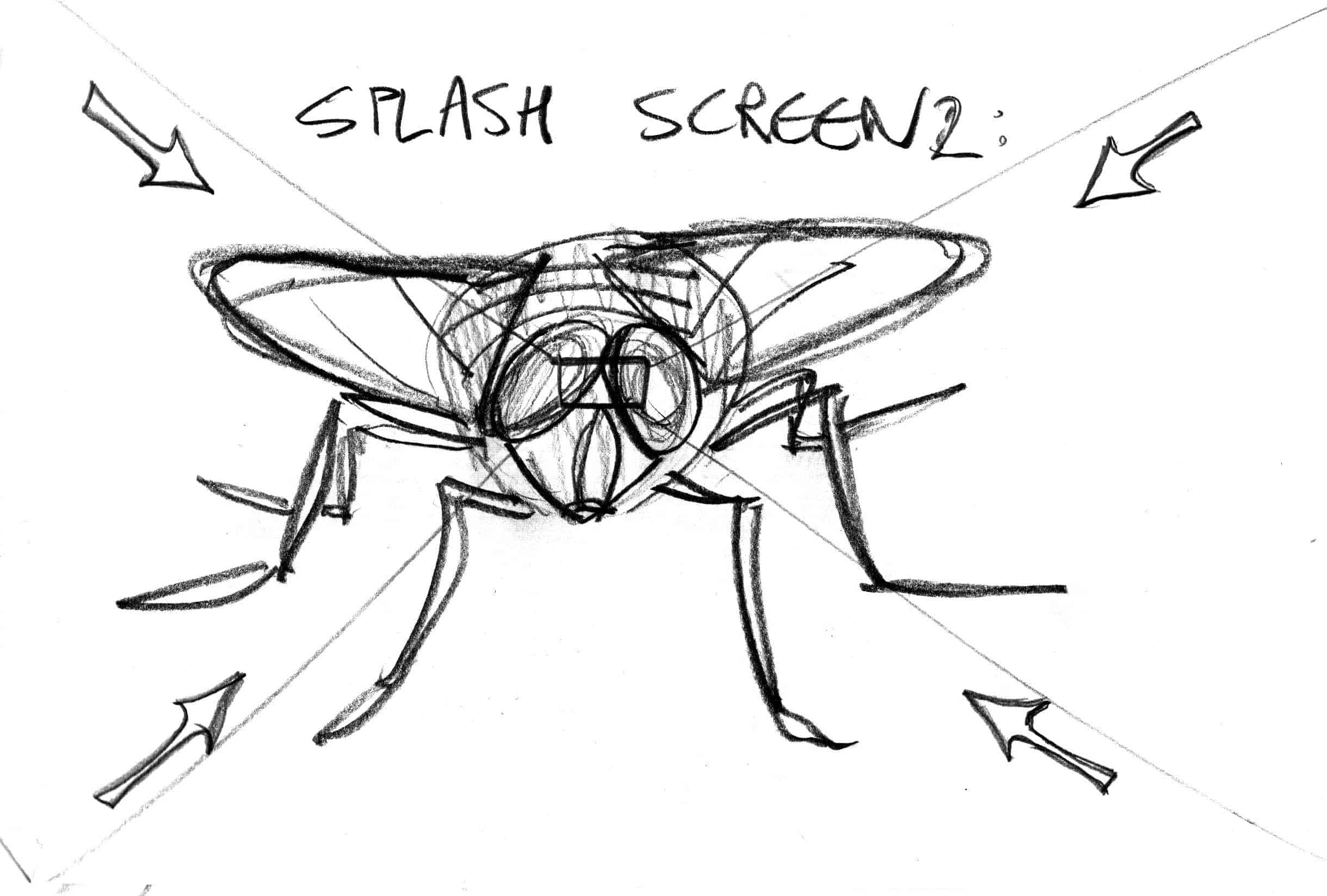
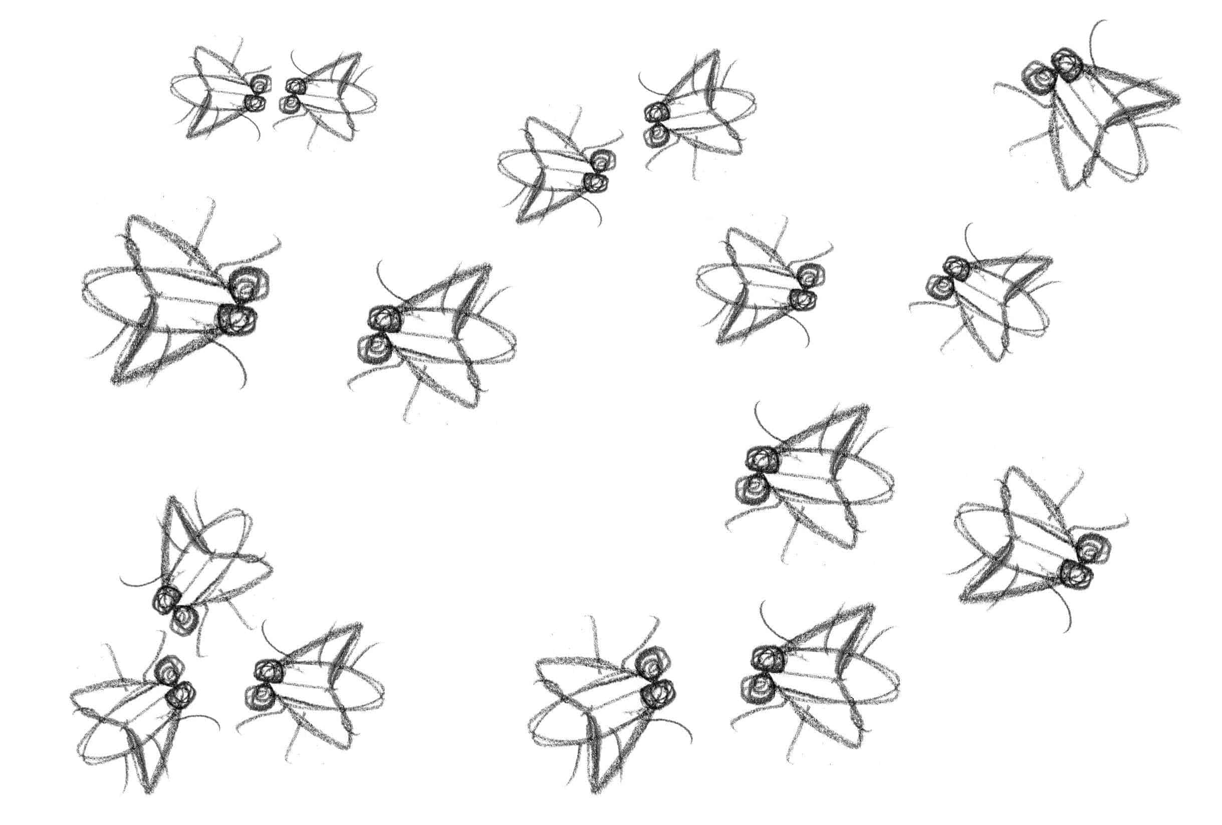
“Fly away” game app concept design + storyboard sketches + illustrations

Bored at work?

Here is the link to the actual ‘finished’ game that I did in 2016:
https://lesliedeanbrown.com/illustration/animation/2202024-LeslieDeanBrown.swf

See if you can swat the fly!

NOTE: This was programmed with Adobe Flash (now called “Adobe Animate CC”), so may need to install the Adobe Flash player to ensure it works correctly. Mozilla firefox doesn’t always play nicely with flash for example.

It’s a very simple game because object oriented programming and animation was a small part of my graphic design diploma. Programming is definitely not my strong point, and it’s free, so don’t expect too much!


25Jan

This is my PhD thesis, from 12 years ago…

Untitled-3

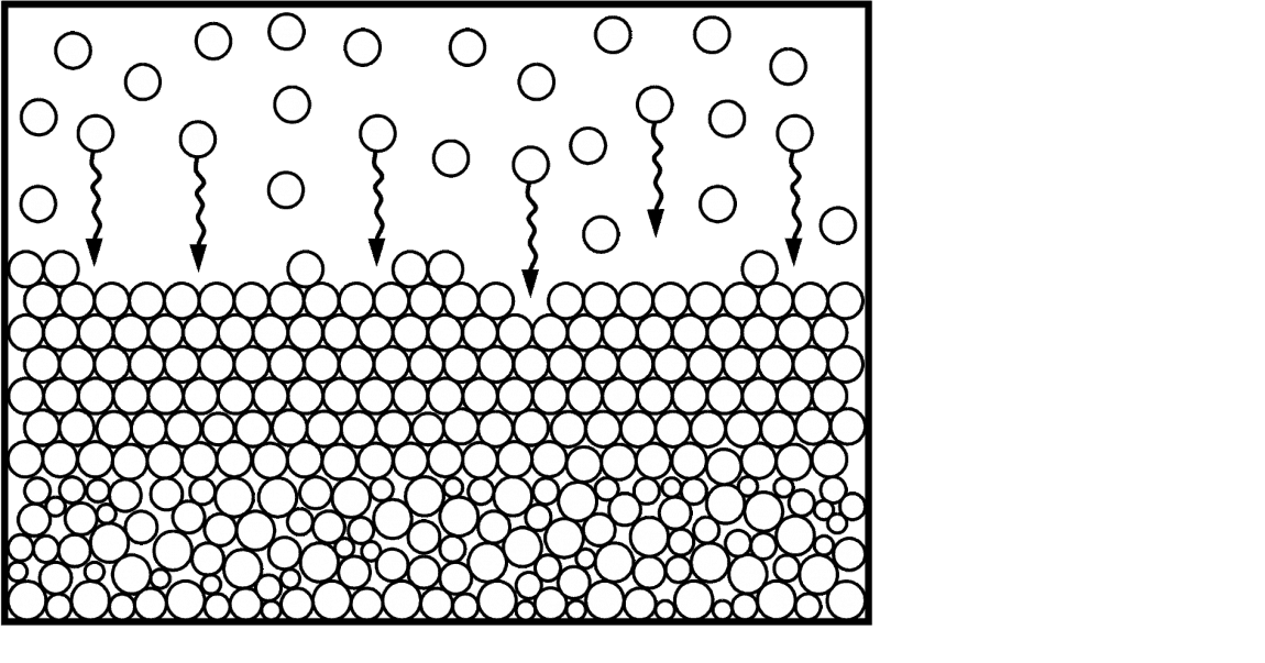
If you’d like to read all about the structure formation of natural opal, this is one of the most complete models of opal formation available anywhere.

Characterisation of Australian Opals — leslie dean brown

At the time I remember my supervisor said to me that it was one of the most well-presented theses that he had ever seen.

Not necessarily the results, but the quality of the illustrations and I guess you could say the “design layout”.

I always want to be proud of my own work and do things to the best of my ability.

Today I was able to open up my original word document file that was almost 12 years old.

To my surprise, it kept the original formatting and page breaks. And why shouldn’t it? Although I am not so keen on the changes that have been implemented to Microsoft Word between since then.

Okay so truth be told, the original word document came in at 281 pages and the printed copy came in at 282. So something was not right.

It turns out that one graph had to be pushed down by one line and the original date was also restored. I was so paraoid that I would forget to change the date, the field updated itself automatically.

The reason I am doing this and sharing it again here is that my thesis was finally digitised by the UTS library this week, but the quality ain’t all that great, because it was rescanned from the printed page.

Hopefully google robots will scour my site, find the pdf and index it so anyone can access it.

So I’m deciding to generate the pdf myself (I never got around to doing that).


23Jan

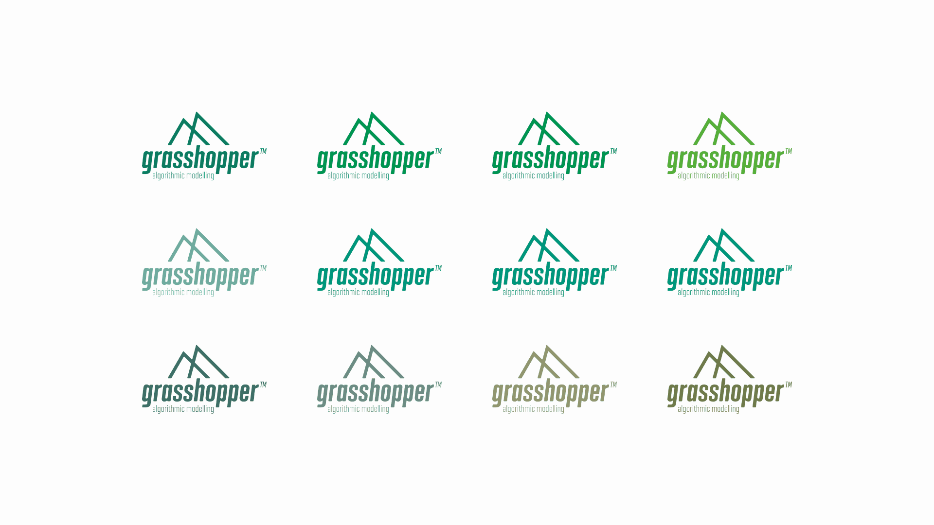
Grasshopper logo concept

I tried to pitch a new logo design to the original inventor of grasshopper3D software the other day, David Rutten. It turns out that it was not a great success, mainly because he is looking for a code-based intro/splash page. He did thank me for my design though…

Here is a part of his reply:

However what I’m hoping to get for GH2 is not so much a single image, as a stylistic language which is flexible enough to be applied to a variety of context while remaining recognisable. Also a certain 3d-ness and computationality should be part of the look. In short, I’m hoping to come up with something which is amenable to algorithmic processing, which means at heart it must be code, not graphics.

21Jan

My typography credentials

These training sessions are in addition to the typography that I studied during my diploma.

I also have many books on design and illutration that I’m currently in the process of reviewing.

The 33 laws of typography

Foundations of typography

Foundations of typography hierarchy and navigation

Foundations of typography working with grids

Foundations of typography — choosing and combining typefaces

Before & after: how to set perfect text

leslie dean brown — illustrator | designer background image