All posts in Design

24Jul

Upper Lachlan Shire logo design.

August 2017 introductory special offer, 50% off logo design (or redesign) throughout the Upper Lachlan Shire, NSW!

$325 for small businesses with 1 to 3 employees.
$480 for medium-sized businesses with 4 to 6 employees.
$640 for larger businesses with 7-15 employees.
$720 for corporations with 16+ employees.

This includes the following suburbs:

Crookwell, Gunning, Taralga, Bannaby, Dalton, Binda, Bigga, Tuena, Breadalbane, Cullerin, Laggan, Oolong.

24Jun

Hilltops logo design

July 2017 introductory special offer, 50% off logo design (or redesign) throughout the Hilltops NSW region!

$325 for small businesses with 1 to 3 employees.
$480 for medium-sized businesses with 4 to 6 employees.
$640 for larger businesses with 7-15 employees.
$720 for corporations with 16+ employees.

This includes the following suburbs:

Young, Boorowa, Murrumburrah, Harden, Bendick Murrell, Bribbaree, Frogmore, Galong, Jugiong, Kingsvale, Koorawatha, Maimuru, Milvale, Monteagle, Murringo, Reids Flat, Rugby, Rye Park, Thuddungra, Wirrimah, Wombat.

24May

Goulburn logo design

In Daily grind, Design by Leslie Dean Brown / May 24, 2017 / Comments are closed

June 2017 introductory special offer, 50% off logo design (or redesign) throughout the Yass region!

$325 for small businesses with 1 to 3 employees.
$480 for medium-sized businesses with 4 to 6 employees.
$640 for larger businesses with 7-15 employees.
$720 for corporations with 16+ employees.

This includes the following suburbs:

 Goulburn, Marulan, Tallong, Towrang, Bungonia, Windellama, Lake Bathurst, Tarago.

24Apr

Yass logo design.

May 2017 introductory special offer, 50% off logo design (or redesign) throughout the Yass region!

$325 for small businesses with 1 to 3 employees.
$480 for medium-sized businesses with 4 to 6 employees.
$640 for larger businesses with 7-15 employees.
$720 for corporations with 16+ employees.

This includes the following suburbs:

Yass, Binalong, Bookham, Bowning, Gundaroo, Murrumbateman, Sutton, Wee Jasper and Brindabella.

24Mar

Bega Valley Shire logo design.

April 2017 introductory special offer, 50% off logo design (or redesign) throughout the Bega Valley Shire!

$325 for small businesses with 1 to 3 employees.
$480 for medium-sized businesses with 4 to 6 employees.
$640 for larger businesses with 7-15 employees.
$720 for corporations with 16+ employees.

This includes the following suburbs:

Akolele, Angledale, Araluen, Bald Hills, Barragga Bay, Batehaven, Batemans Bay, Bega, Belowra, Bemboka, Benandarah, Bergalia, Bermagui, Berrambool, Bimbimbie, Bingie, Black Range, Bodalla, Bournda, Boydtown, Broadwater, Brogo, Broulee, Buckajo, Buckenbowra, Burragate, Cadgee, Candelo, Catalina, Central Tilba, Chinnock, Cobargo, Coila, Congo, Coolagolite, Coopers Gully, Corunna, Currowan, Cuttagee, Dalmeny, Denhams Beach, Deua River Valley, Devils Hole, Dignams Creek, Doctor George Mountain, East Lynne, Eden, Eurobodalla, Frogs Hollow, Greendale, Greigs Flat, Guerilla Bay, Jellat Jellat, Jeremadra, Kalaru, Kameruka, Kanoona, Kiah, Kianga, Kingswood, Kiora, Lilli Pilli, Lochiel, Long Beach, Maloneys Beach, Malua Bay, Merimbula, Meringo, Merricumbene, Millingandi, Mirador, Mogareeka, Mogendoura, Mogilla, Mogo, Morans Crossing, Moruya, Moruya Heads, Mossy Point, Mount Darragh, Murrah, Myrtle Mountain, Mystery Bay, Narooma, Narrabarba, Nelligen, Nelson, Nerrigundah, Nethercote, New Buildings, North Batemans Bay, North Narooma, Nullica, Numbugga, Nungatta, Nungatta South, Pambula, Pambula Beach, Pericoe, Potato Point, Quaama, Reedy Swamp, Rocky Hall, Rosedale, Runnyford, South Durras, South Pambula, South Wolumla, Stony Creek, Sunshine Bay, Surf Beach, Surfside, Tanja, Tantawangalo, Tarraganda, Tathra, Tilba Tilba, Timbillica, Tinpot, Tomakin, Toothdale, Towamba, Tura Beach, Turlinjah, Tuross Head, Verona, Wallaga Lake, Wallagoot, Wamban, Wandella, Wapengo, Wolumla, Wonboyn, Woodlands, Wyndham, Yellow Pinch, Yowrie.

03Mar

My free video/audio tips

I can only do minor colour corrections and things like that (which youtube can do anyway). My video ‘editing’ is done with with after effects templates. Meaning I have paid others to do that for me. So I am not what is called a motion graphics designer, but rather a graphic designer/illustrator who specialises in 2d/static images.

In any case, I don’t recommend physically distorting your raw videos using post-processing. If you’re thinking of doing that, don’t. Because your face will also distort… and you will lose resolution & quality. I’m not saying necessarily to redo the ones you already recorded, because that is a PITA. I know.

But I do think it is better to record all *new* raw videos with better lighting and a dedicated mic (eg a lapel mic). That’s the only way. Not everything can be fixed up in post-processing. Better to get it right to start with.

The easiest thing to do is probably just do a screen grab. And possibly embed a webcam of yourself if you want to appear on the video (which lends more credibility, as you are showing your face to the world).

I will try to be a bit more clear here (ugh, design is hard, always lots of communication). What I am saying is, if you are going to do it that way, by standing in front of a camera, IMHO, I think it is better to zoom way back out and do a proper presentation (meaning on a type of stage in a nice environment) OR else set up the map info/source so you don’t need to do any cropping at all, so that what we see is at 100% already.

It’s always going to be difficult to get the correct exposure for both your face and the video (which is black) if you record both simultaneously. I.e. If you put the room light on, the video will look washed out, lose saturation. Vice versa.

Your focus of the video here is that dynamic map. Which is great. So that should be recorded from the original device, not through another camera. Using the video card on your computer for example. You can get software that does this for free. Even when meterologists/weather presenters do their thing, it’s usually composited separately. Meaning they are standing in front of a green screen and the video input of the map comes directly from a computer. And then they blend both together.

If you want to do it the proper Greenscreen way, I would actually consider signing up to Lynda.com for a month or two, which is only like $30 or something, get pro advice from people that know what they are talking about (not me). And you can usually find or get the 1st month for free (a trial). Like I had to learn a bit of After Effects with this guy called rich Harrington. For instance this video Video Gear: Technical Tips, chapters 8-12 may help you a lot. Watch that first then decide if you want to invest in that kind of setup.

I do think standing up in front of an audience adds more credence to what you are saying (see the two vids below as well). So if you don’t go the greenscreen approach, perhaps you could still consider recording a webcam of yourself standing up in front of your computer (which is at the right height). Then the software will or can automatically embed a little video of yourself in the corner, like picture-in-picture. That’s definitely the easy way! Still get the mic though. Sound is just as important is vision.

Instant demo of poor audio vs video quality:

Fantastic demo of different mics + positions.

Make sure the background setting is nice too, people look at that. Look at my background on a few of my 1st webcam videos for instance. It’s shot from my freakin’ bedroom. And it looks horrible/amateurish. The other videos from my own point of view look better (I think).

Another free design tip I can give you is to keep a consistent width on the embedded videos/images in your blog. Right now your images are not a consistent aspect ratio and they are about 496-502 pixels wide whereas your videos are only ever 400. I would make them all 500, 16:9 ratio.

Yes it is extra work, but worth it. I can guarantee you that people –unfortunately– will judge based not just on logic alone, but also appearances. The presentation is everything. I think most scientists don’t fully appreciate that. I never did [before].

24Feb

Eurobodalla Shire logo design.

March 2017 introductory special offer, 50% off logo design (or redesign) throughout the Eurobodalla Shire!

$325 for small businesses with 1 to 3 employees.
$480 for medium-sized businesses with 4 to 6 employees.
$640 for larger businesses with 7-15 employees.
$720 for corporations with 16+ employees.

This includes the following suburbs:

Akolele, Batehaven, Batemans Bay, Bega, Belowra, Benandarah, Bergalia, Bimbimbie, Bingie, Bodalla, Boyne, Broulee, Broulee, Buckenbowra, Cadgee, Central Tilba, Coila, Corunna, Dalmeny, Deua River Valley, Deua. Bolaro, Dignams Creek, Guerilla Bay, Jeremadra, Kianga, Kiora, Lilli Pilli, Malua Bay, Meringo, Merricumbene, Mogendoura, Mogo, Moruya, Moruya Heads, Mossy Point, Mystery Bay, Narooma, Nelligen, Neringla, Nerrigundah, North Narooma, Potato Point, Rosedale, Runnyford, South Durras, Sunshine Bay, Surf Beach, Tilba, Tilba Tilba, Tinpot, Tomakin, Turlinjah, Tuross Head, Tuross Lake, Wamban, Wandera


15Feb

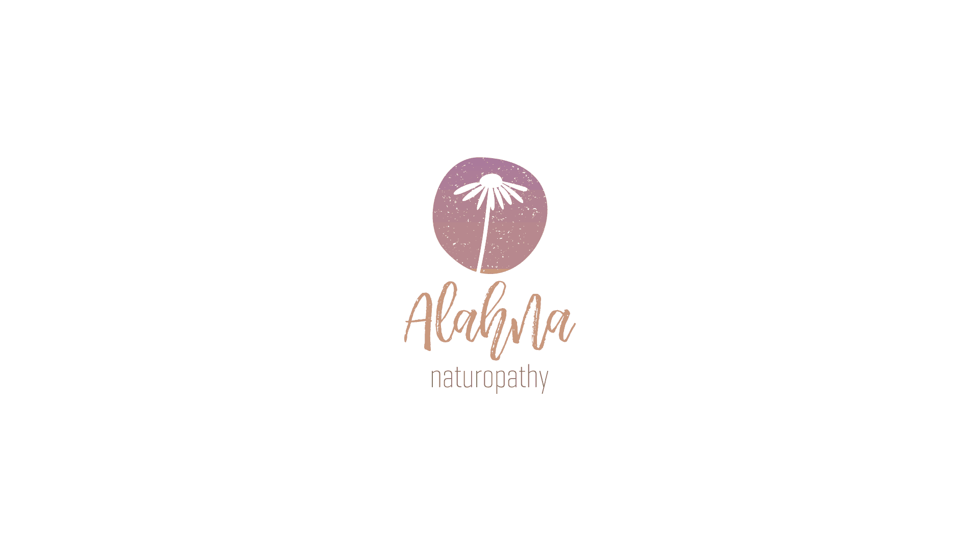
It looks like I lost this client.

Someone approached me late last year to design a business card and possibly rebrand for them as they weren’t happy with their current design.

It was for a naturopath. I really wanted to take on this project. It’s just the sort of clients I’m looking for. Ones that care about the environment. Businesses that provide services.

Now I like to think that I’m a pretty good designer, but I don’t have all that much practise dealing with clients.

So after a few emails I mentioned that they would have to sign a contract for the work to begin.

That was my first mistake. Never again am I going to mention the word ‘contract’. From now on, it will be referred to as “an agreement” or simply “terms and conditions“.

Now I am very keen to design logos. Perhaps too keen. So I started designing it anyway without signing anything.

Why? Because we designers like to start projects early so that we can sit on designs for a few weeks to properly evaluate them. That’s why.

That was my second mistake. Without a contract, I wasn’t actually going to send anything to the client. I mean why should I? I have zero obligation to.

But then I sat on it and I thought about it for a while. And after about a month of no contact, which is too long, I actually sent the previous iteration of this logo to the client, along with two others, like a “free sample” of what I can do.

Because I thought: “well they should at least see what I’ve done, they might like it. It might show that I am enthusiastic about the project and keen to start designing”.

Because sometimes you have to do that in order to get started. You can’t be expected to design logos for people if you have none to show. Right? So it’s a bit like the chicken and the egg syndrome.

And again there has been no response. None. Regardless, at the time. I was still baffled as to why I lost that client.

I can only assume that the client either didn’t like it, didn’t think I was capable of refining my designs even further, didn’t want to sign the contract or perhaps they simply weren’t ‘ready’ to work with a designer.

Since then I have watched about 6 more hours of logo design courses. And I think I know now what was wrong. I think all the ones I sent were all too modern. To me they looked too much like they belonged on a bottle of suncream. But there was nothing more I could do. Without a contract and zero communication, I can’t really go any further. How can I?

I have tweaked in further since they saw it last, and I think this version is superior. And I’d like to show it to my potential future clients anyway.

I changed the typography, added some texture and made it more hand-drawn, so that it appears more natural. Who doesn’t like this logo? I think it’s pretty good…

I would have liked to see this logo on a shopfront. I think this logo could have gone a long way. A long way.

It could have been the start of a multi-million dollar brand. I can see this brand mark on naturopathy bottles. Who knows? Who knows.

As my father used to say “oh well”. I try not to let it bother me.

When taking on board clients, designers take risks. More as a note to my future self than to you, that is why we don’t work without contracts.

What I have I learned by this? Well I have learned that the word ‘contract’ freaks people out. I have learned to stick to my guns and not work for people without contracts, because it shows that they are not as committed as they think they are to hiring a designer.

26Jan

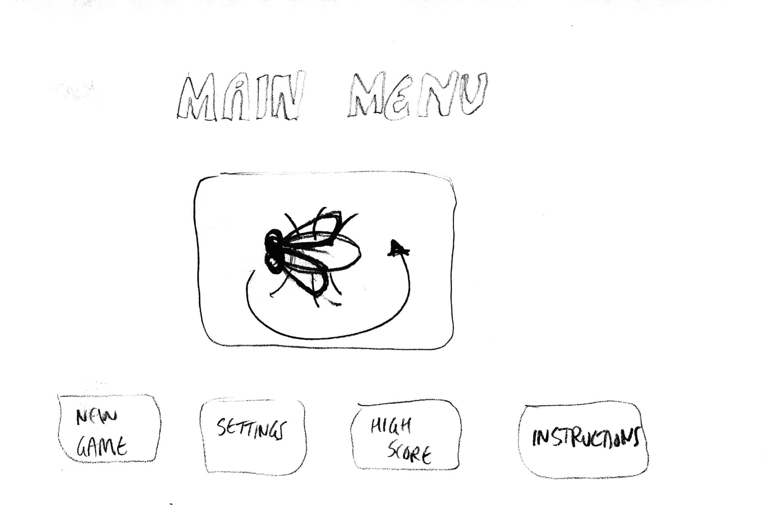
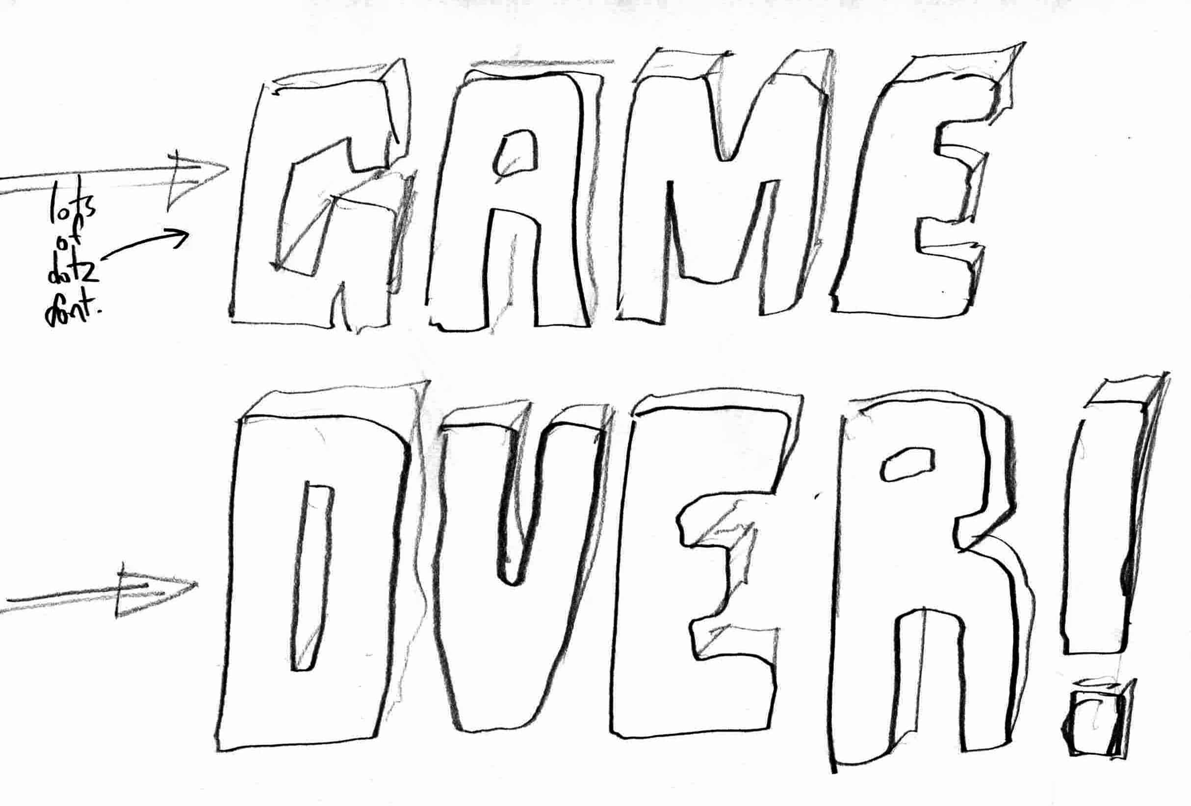
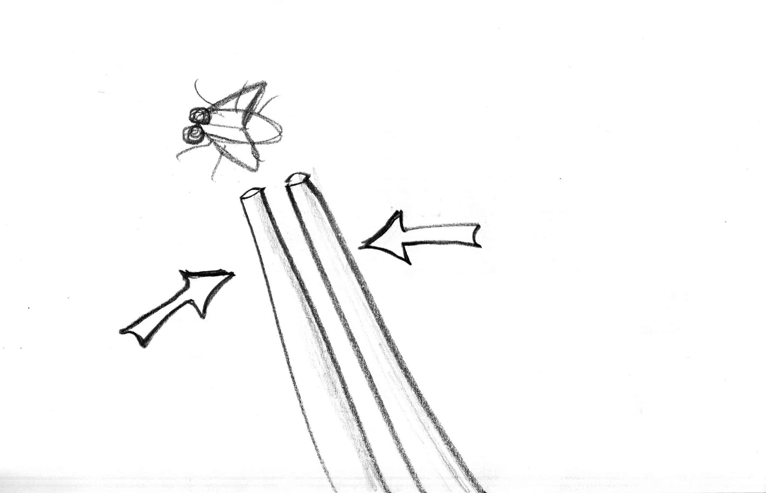
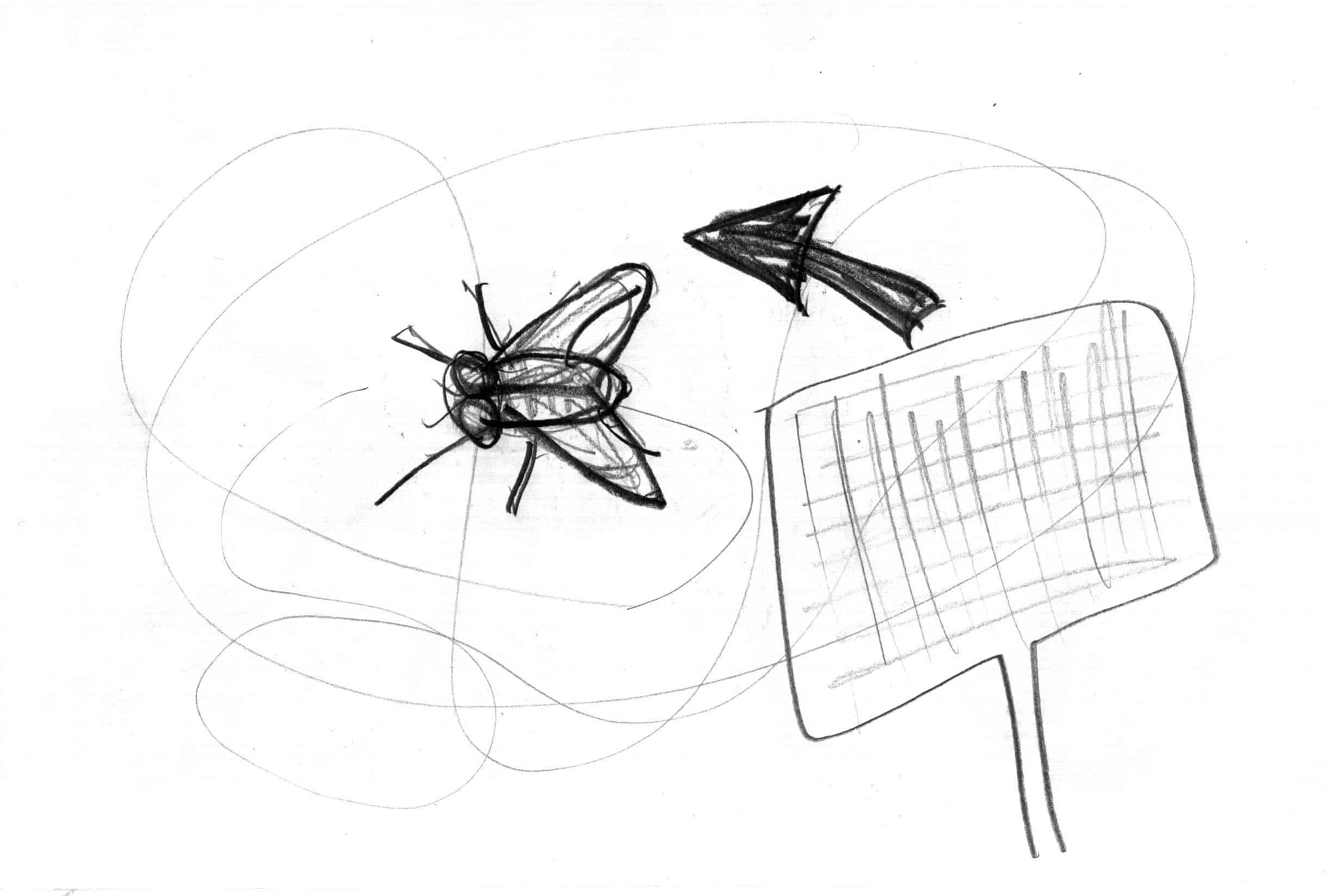
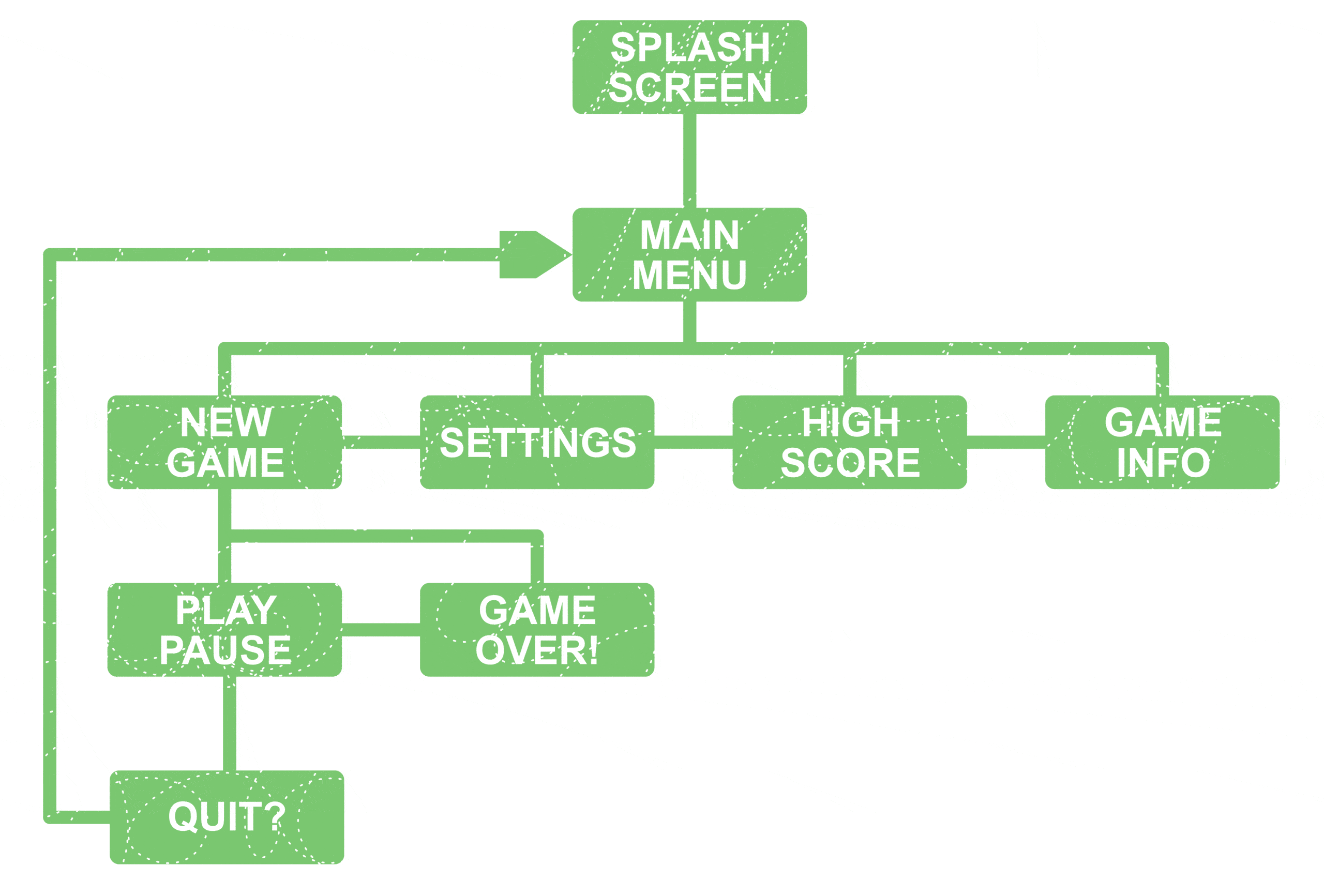
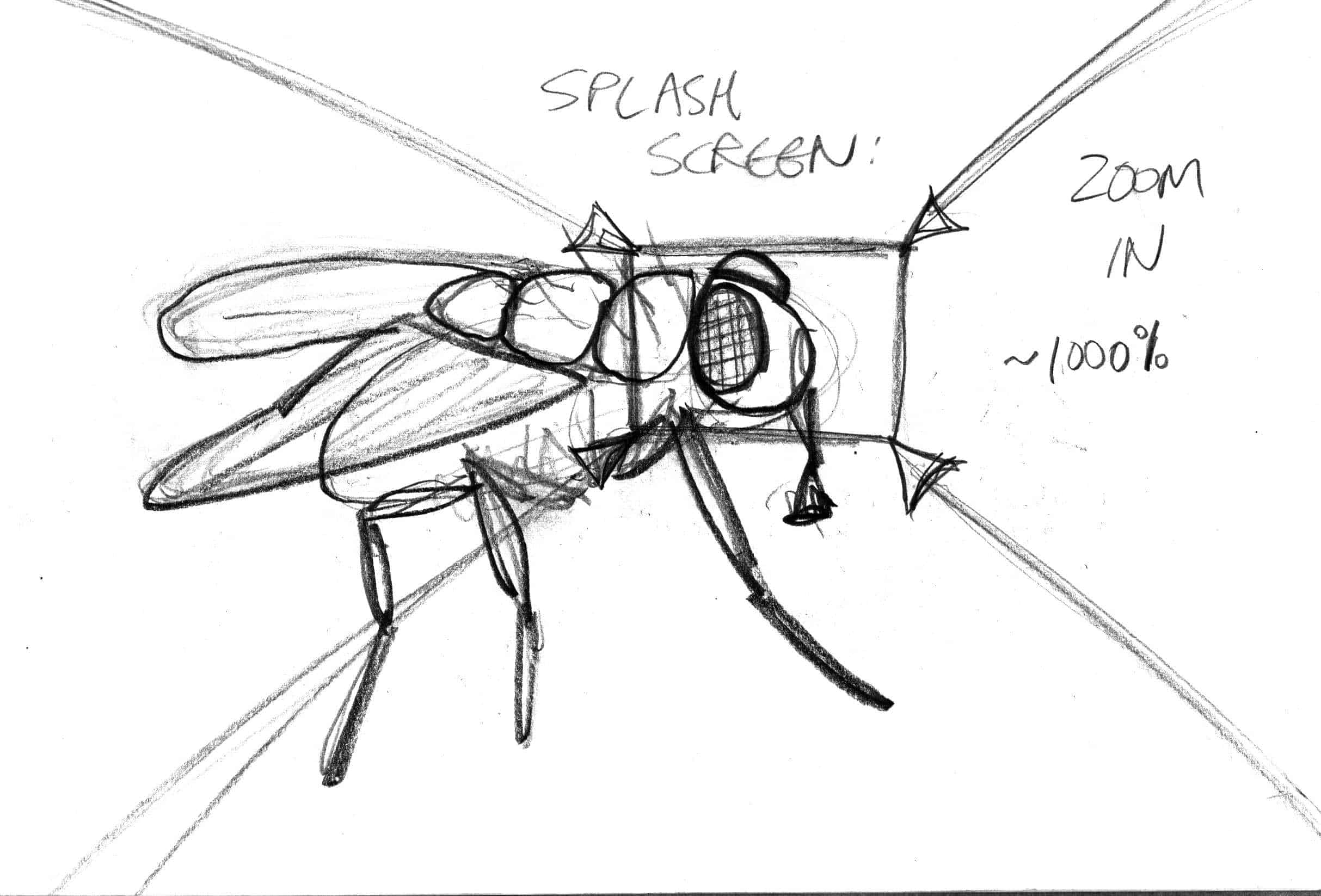
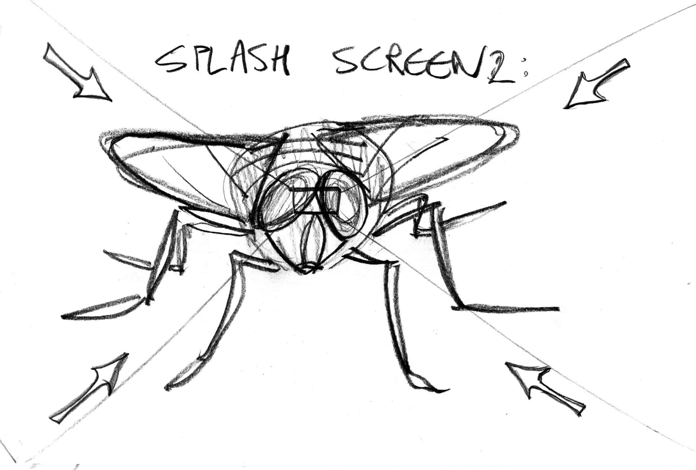
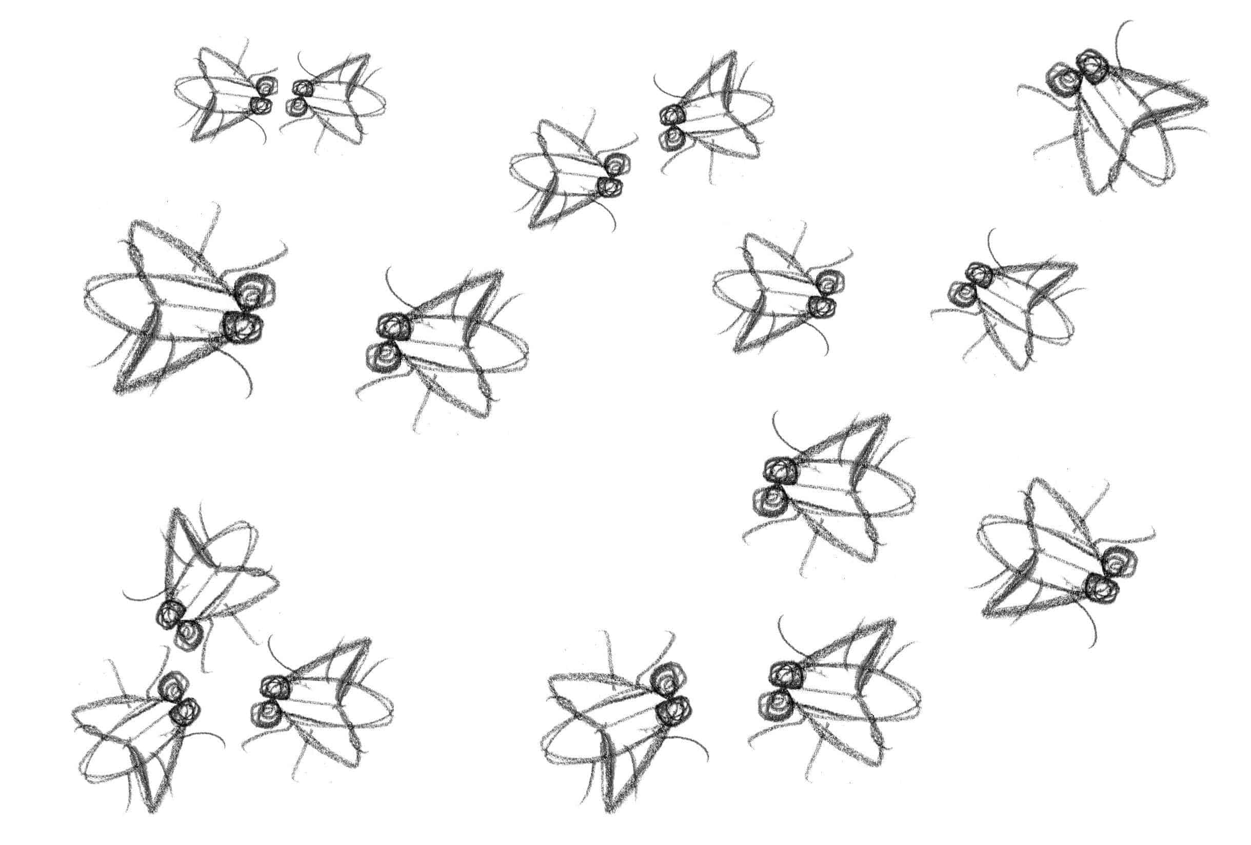
“Fly away” game app concept design + storyboard sketches + illustrations

Bored at work?

Here is the link to the actual ‘finished’ game that I did in 2016:
https://lesliedeanbrown.com/illustration/animation/2202024-LeslieDeanBrown.swf

See if you can swat the fly!

NOTE: This was programmed with Adobe Flash (now called “Adobe Animate CC”), so may need to install the Adobe Flash player to ensure it works correctly. Mozilla firefox doesn’t always play nicely with flash for example.

It’s a very simple game because object oriented programming and animation was a small part of my graphic design diploma. Programming is definitely not my strong point, and it’s free, so don’t expect too much!


leslie dean brown — illustrator | designer background image